{LIVE PREVIEW COMING SOON}
Contents
Brief
Zsofia Dankova is an illustrator and concept artist. She has a large following on platforms such as DeviantArt and Instagram, where she has amassed a combined following of over 40,000 followers and has made a name for herself for her work with large heavy metal bands such as Powerwolf and Elvenking.
She wanted a website which could showcase her artwork to both her fans and potential employers, and would help her to get more work.
However, each one of her projects is different in nature and a single template would not work for every project. For example, some for projects, Zsofia illustrated more than one image or had her work printed on multiple things. She also had progress shots and speed paints for some of her work, but not others.
Solution
0. Summary
I created a landing page which used a technique called “parallax” to animate a painting Zsofia made for this purpose. The aim of this was to make the site stand out from other portfolio sites.
I also created several blocks for Gutenberg, the new WordPress editor, which allows Zsofia to organise each post differently.
1. Landing Page
Given the increase of Page Parking, especially amongst Millenials and young adults, we wanted to make the landing page stand out. Younger users typically open multiple tabs on search engine results pages at once and later quickly click through them to see which of them seem the most relevant. [1]
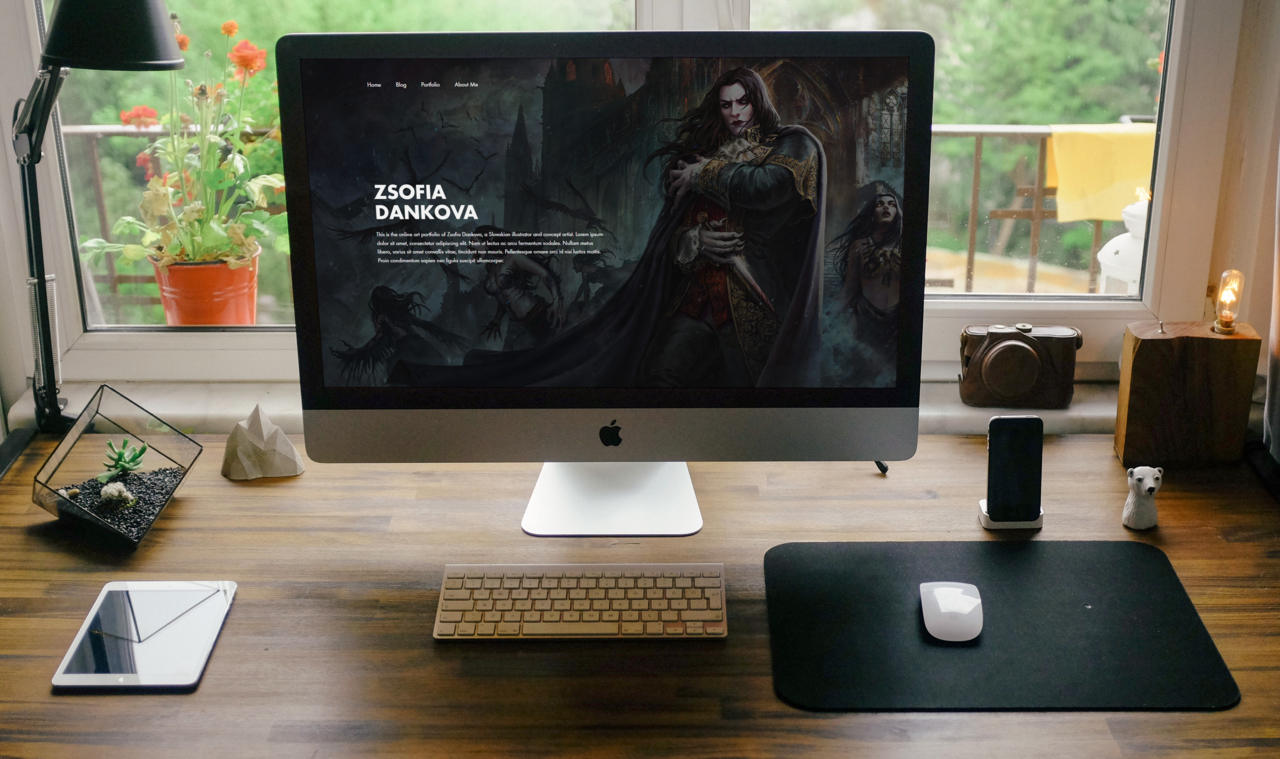
On most sites, I tend to avoid overusing graphics which could slow down the site and cause lag, but on Zsofia’s site, the graphics are the most important thing. I therefore initially started with a full-bleed image as the background, so that Zsofia’s art style and technical ability would be immediately apparent with one glance at the landing page. But it still needed something to make visitors hesitate before skipping to the next tab.
Introducing Parallax. Parallax is a technique which has been used for decades in traditional 2D animation, where an image can be painted in layers, and each layer can be moved at different speeds to create the illusion of depth. I suggested this to Zsofia, and she created a magnificent piece of art which follows the visitor’s cursor around the page. (Mobile visitors will have the background animated as if a camera was panning across it).
Although subtle, we hope that this will make visitors stop for a moment as they realise that the page is interactive, thus reducing the bounce rate.
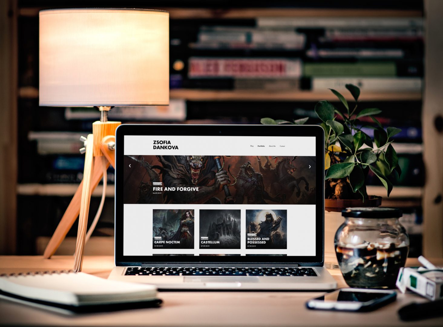
2. Portfolio Archive
The next most important part of the site was the portfolio section. A recent study by the Neilson Norman Group (NNG), showed that 57% of user’s page-viewing time above the fold and 74% of the viewing time was spent in the first two screenfuls [2]. I thought that it would be important to have large images to show the detail in some of the artworks, but real estate above the fold was too expensive for large thumbnails. To compromise, I settled for having a carousel showing the latest artwork, which occupies about 50% of the viewport height. This left enough space for the first row thumbnails to still be visible above the fold, encouraging visitors to scroll down to the second half of the page.
Single Artwork Page
The single artwork page needed to be versatile. There was different content for each type of project, so the layout needed to be easily customisable.
I made two templates for the single artwork page, one of them has a full-height and width header, and the other occupies only 50% of the viewport. This
Thankfully, with the WordPress 5.0 update, Gutenberg is now the default editor, allowing us developers to make modular blocks which can be inserted wherever the user wants.
I developed three new blocks, in addition to the blocks included by default by WordPress:
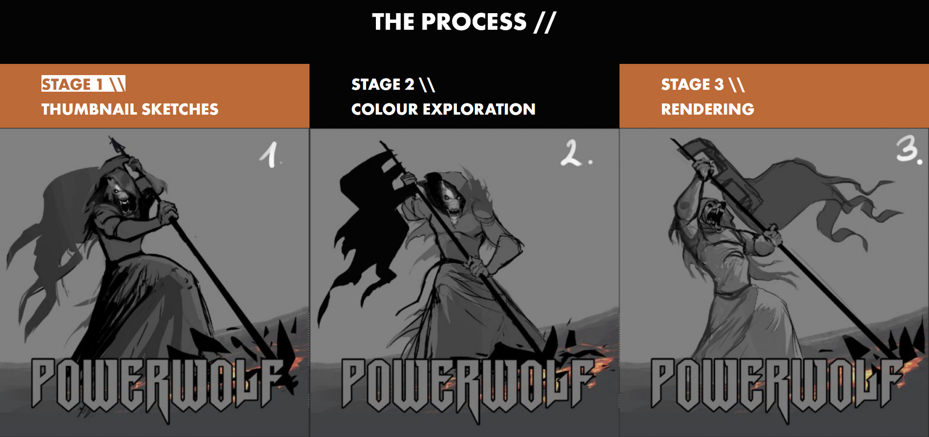
- Artwork Stages. This block allows Zsofia to show her process of creating artwork, such as the initial thumbnail sketches and colour exploration. Each stage is a button which when clicked, reveals the image associated with that stage in the process. This way, the block does not occupy too much space and the extra images are only loaded if the user clicks to reveal them, therefore decreasing page load time.
- Carousel. The carousel block is a carousel much like that on the portfolio archive page. However, the block allows Zsofia to chose specific artwork to feature in the slider. For example, she may wish to have a slider at the end of a project showing other work completed for similar clients.
- Section. This is a rich-text editor which allows Zsofia to add a coloured background of her choice to the text inside. It also allows her to set custom margins and padding, thus allowing the section block to be very versatile, as negative margins can be used to intentionally make images overlap.
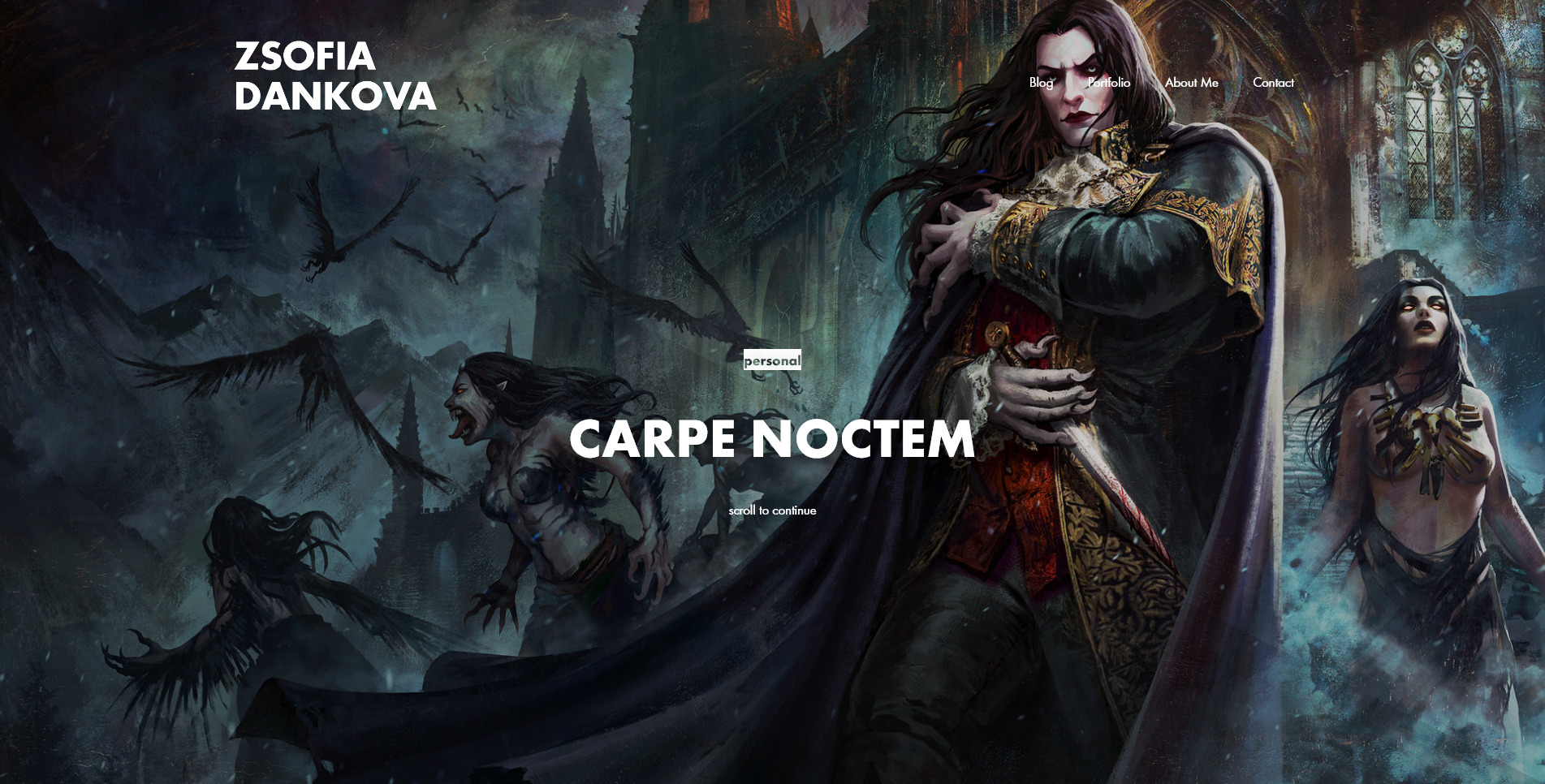
Full-height header for single artwork 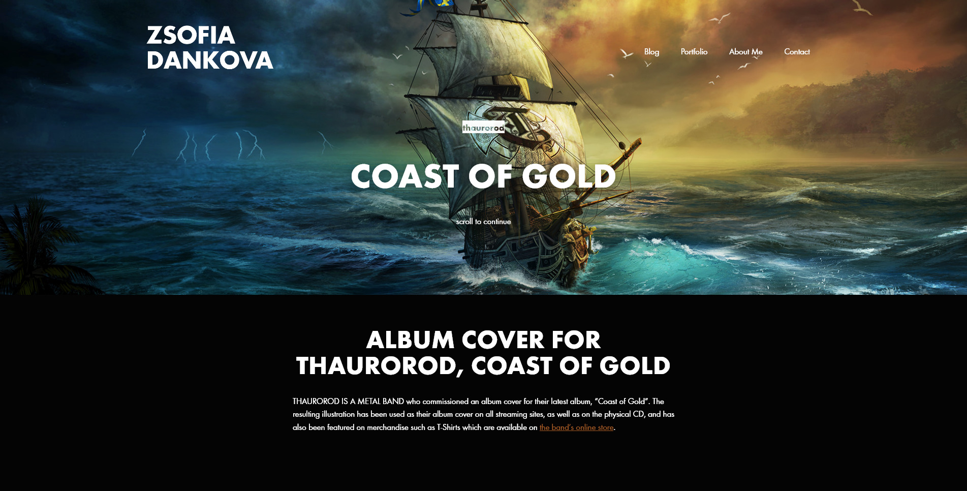
Half-height header for single artwork 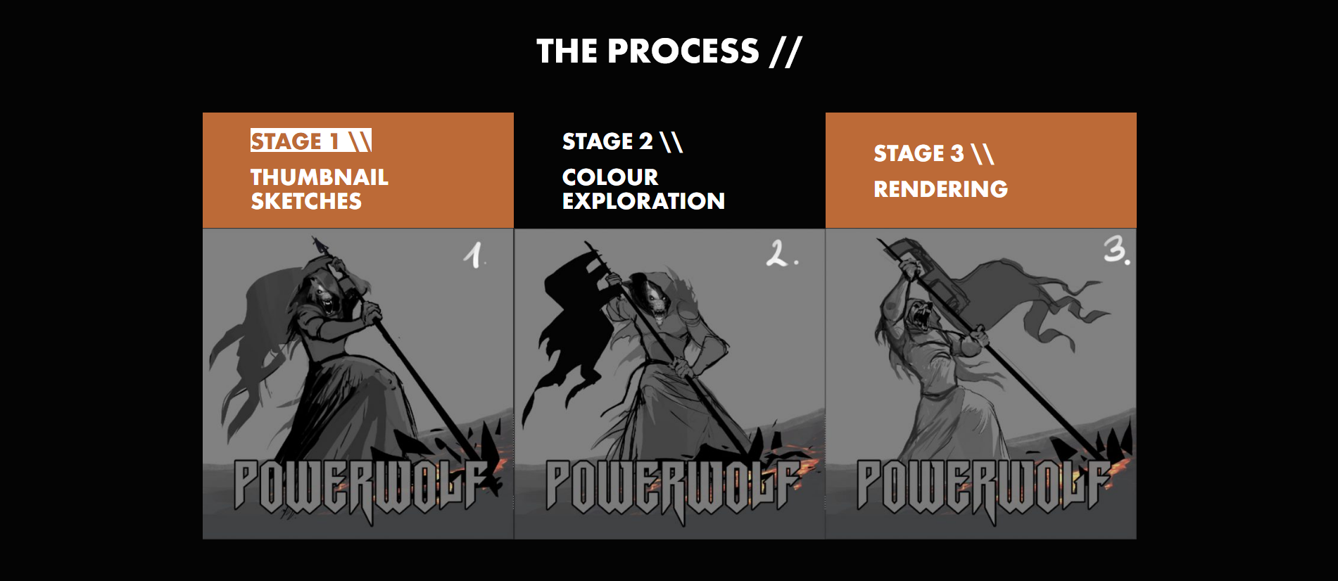
Stages Block with three stages 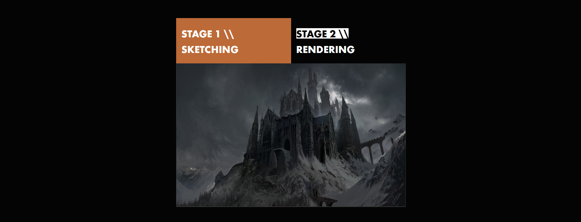
Stages Block with three stages 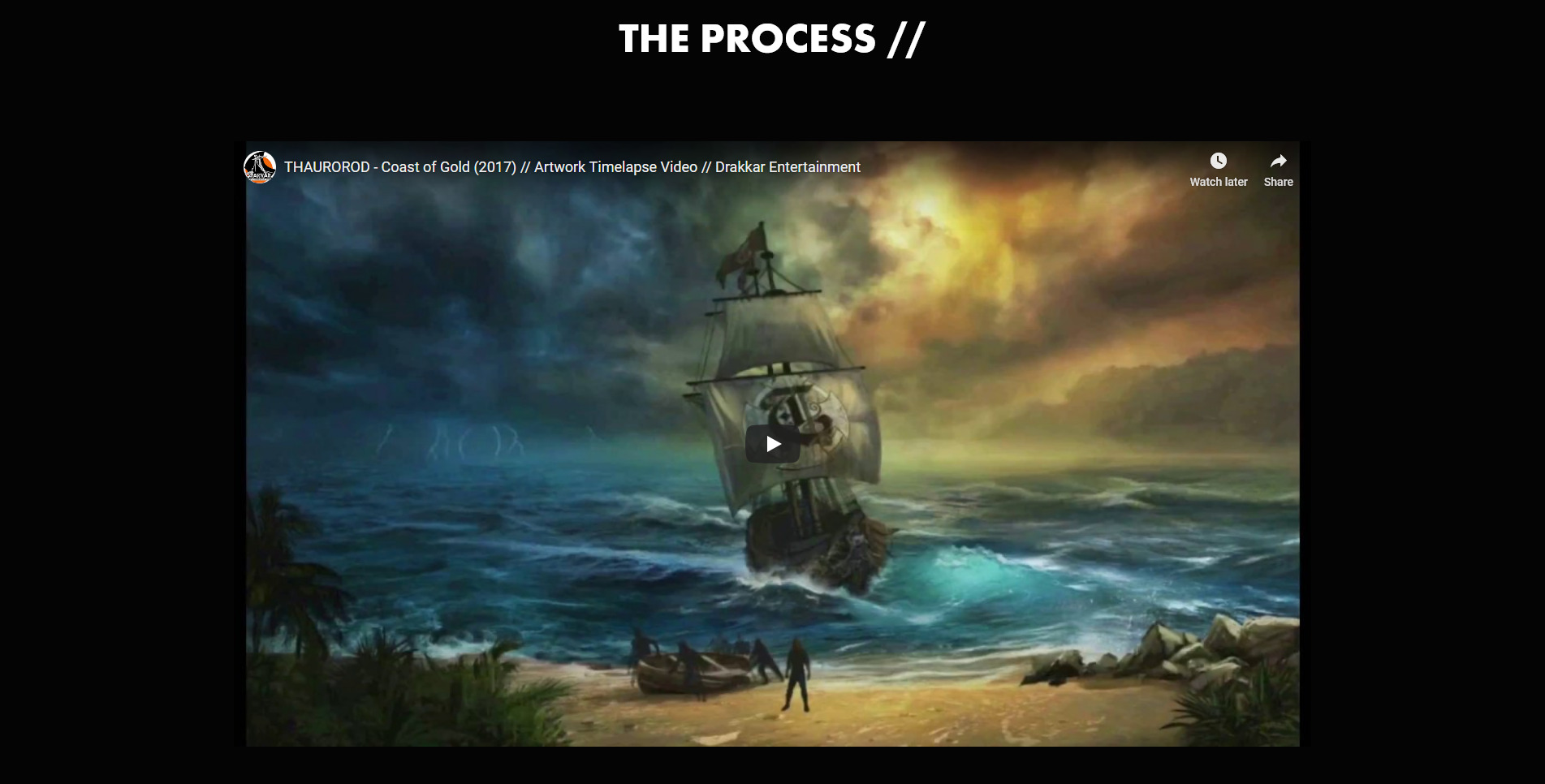
YouTube Embed Block with two stages 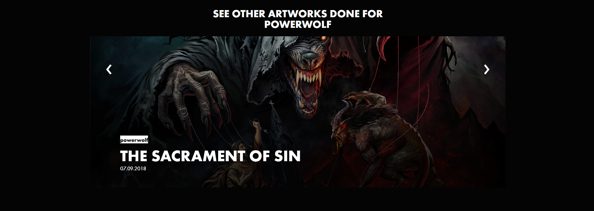
Carousel block
Gutenberg also allows developers to add different alignment modes. Aligncenter is centre-aligned with the width equal to the content width. Alignwide is slightly wider than the content width, and alignfull is the width of the entire viewport. All blocks support all these alignment options:
Stages block aligned full 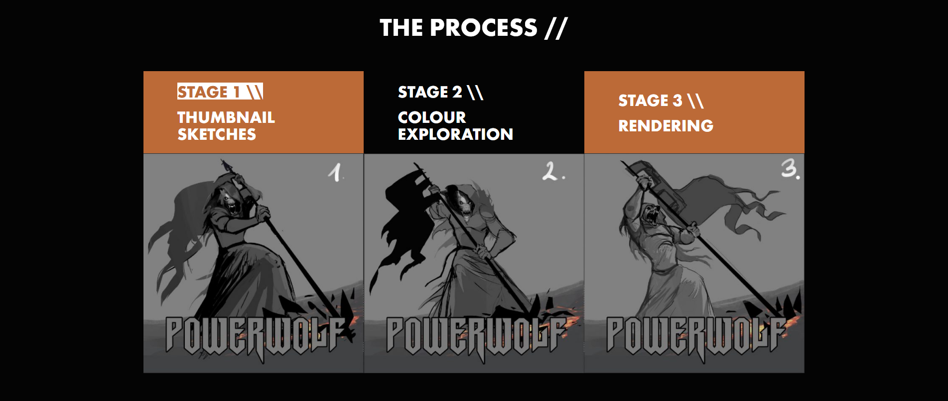
Stages block aligned wide 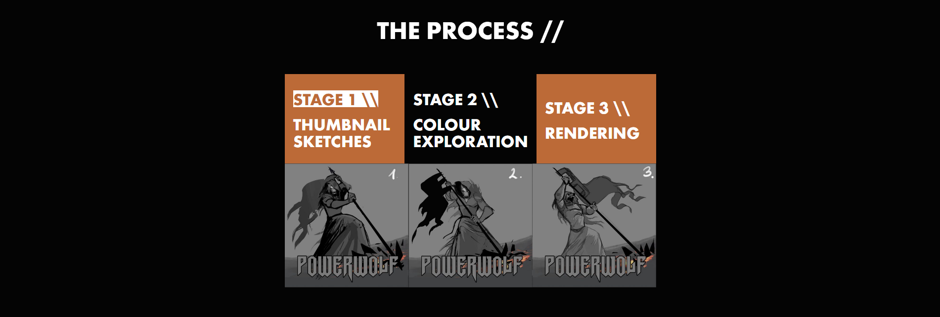
Stages block aligned center
The versatility of these blocks allows pages to be made to suit all types of artwork.
References
[1] Nielsen Norman Group | Page Parking: Millennials’ Multi-Tab Mania
[2] Nielsen Norman Group | Scrolling and Attention
Technical Details
- Languages used: PHP, JavaScript, CSS, HTML
- Built for WordPress using _s to speed up the process of building the theme
- ACF was used to create the custom blocks